
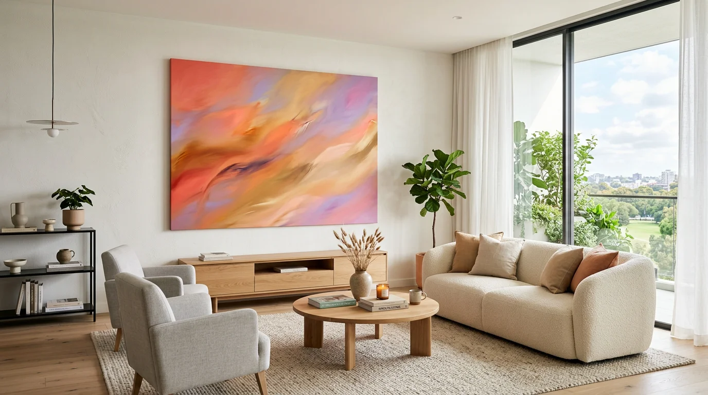

Warm color does something you can feel in seconds. A glowing band of orange, coral and gold can lift a room and steady your mood before you consciously register the image. That instant pull is exactly why abstract sunset paintings keep landing on walls in homes, studios and offices around the world. If you want a deeper primer on the theme, our guide to abstract art inspired by sunsets is a useful starting point.
The appeal is not just aesthetic. Color reaches the emotional centers of the brain fast, and warm hues carry strong associations with energy, joy and comfort. According to a Skillshare overview of color psychology, hue is not merely a visual experience but something that shapes emotion, behavior and perception. Sunset abstraction leans directly into that effect.
Why sunset abstraction hits differently
Search for an abstract art sunset and you will find thousands of interpretations, from soft gradients to bold, gestural color fields. What unites them is intent: they trade a photographic horizon for feeling. Instead of documenting a place, they distill the temperature and rhythm of dusk into pure color.
That abstraction is what gives the genre its range. A minimalist band of peach can feel meditative, while a saturated wash of scarlet and amber can feel electric. The same subject flexes to match your space, which is rare for a single theme.
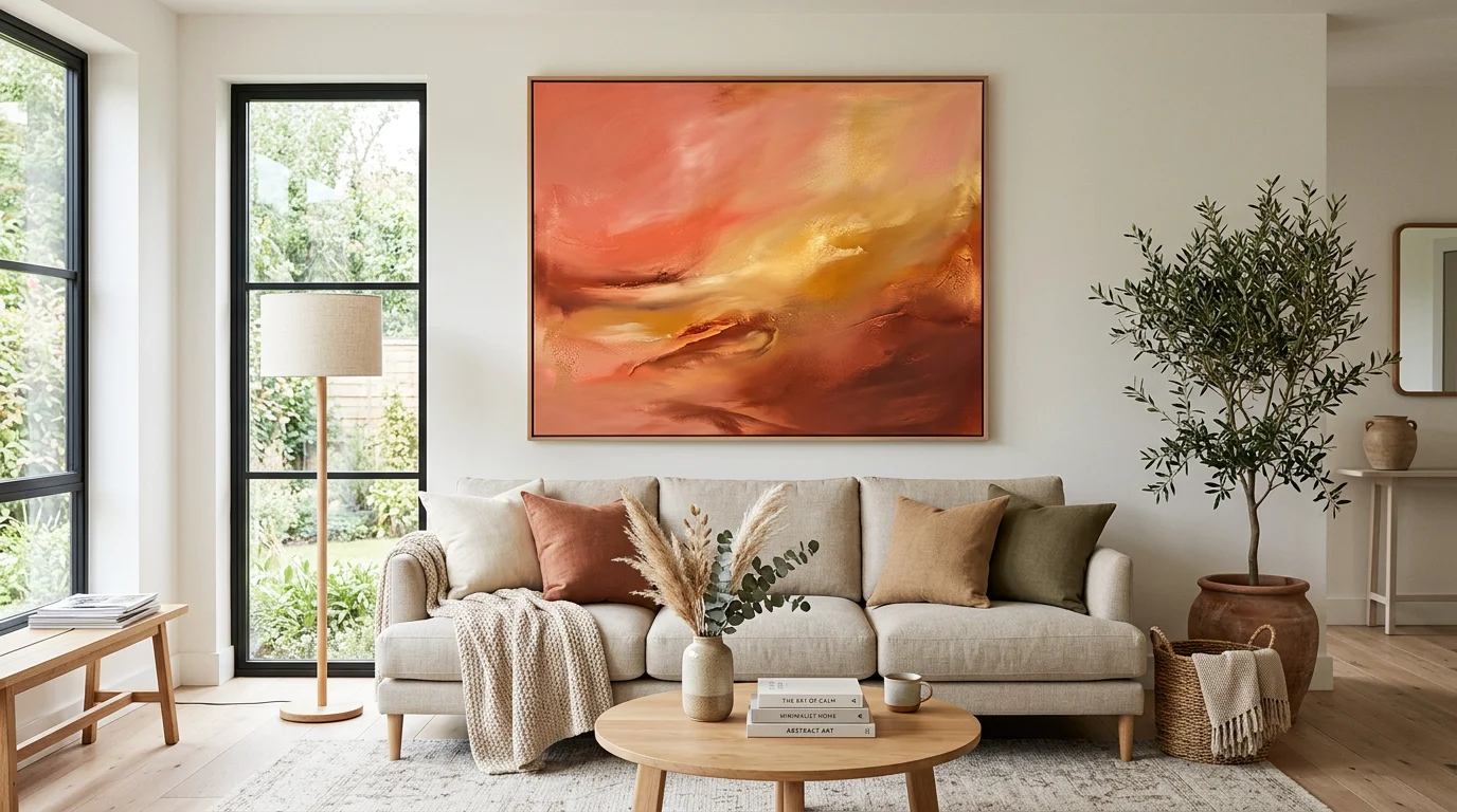
The color psychology behind the palette
There is real research under the warm glow. In a peer-reviewed study on color emotional perception, both art and non-art participants rated warm colors like red, orange and yellow more positively, pointing to a shared association with warmth, energy and joy. A sunset palette sits squarely in that warm register.
Context matters too. An academic review of color psychology notes that people in warmer, sunlit regions tend to prefer bright, warm colors, while those from cooler climates often lean toward cooler, less saturated tones. That helps explain why a warm color palette reads as inviting in some homes and dramatic in others. Your own light and climate quietly shape how the piece lands.
A few working associations are worth keeping in mind when you shortlist a piece:
- Orange and coral tones: friendly warmth, creativity and optimism.
- Golden yellow: the color of sunlight itself, tied to energy and cheer.
- Deep red accents: high arousal and drama, best used as a focal signal.
- Violet and rose edges: the calmer, cooler bridge that keeps a sunset from feeling loud.
Styles you'll actually find
The theme splits into recognizable styles, and knowing them makes shopping far faster. Minimalist versions strip the scene to two or three bands of color. Boho takes are earthier and more textured. Vintage interpretations mute the palette toward dusty terracotta, while contemporary color-field pieces push saturation hard.
This variety is not new to art. As a design analysis of color psychology points out, the spirit of each era has always shown up in how artists used color, tied closely to the pigments available at the time. Sunset abstraction is simply the current, very warm chapter of that long story. If you want a curated range of handmade pieces, browse our abstract canvas wall art to compare styles side by side.
Print, original or custom: how to choose
Not all sunset art is created equal, and the format you pick changes both the feel and the value. Mass-market marketplaces offer instant, low-cost prints. A handmade original brings texture, signature and one-of-a-kind character. A commission lets you dictate palette and scale from scratch.
| Option | What you get | Uniqueness | Typical timeline |
|---|---|---|---|
| Mass-market print | Reproduced image on paper or canvas | Low, widely reproduced | Immediate |
| Our matched originals | Handmade, signed original (no prints) | High, one of a kind | Ready to ship or matched |
| Our custom commission | Made to your brief, from 680 $ CAD | Fully bespoke | 2 to 6 weeks |
If you already own a piece you love, matching around it is easier than starting cold. We can suggest works that complement a photo you upload, so a new sunset canvas sits in conversation with what you have rather than fighting it.
Placing it in your space
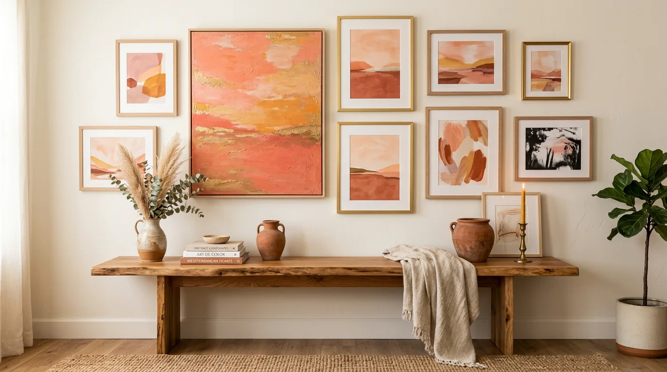
Scale and light decide whether a warm piece sings or sinks. A large canvas becomes the focal point of a room, so give it a wall with breathing space and let the sunset tones echo one or two accents nearby. Smaller pieces work in clusters, where the warmth builds across a grouping.
Think about the light the wall actually gets. Warm afternoon light amplifies orange and gold, while a cool north-facing room can use those same tones to add warmth it otherwise lacks. For layout inspiration, our wall art ideas featuring sunset colors walk through arrangements that feel intentional rather than crowded.
Bringing it all together
An abstract sunset painting is a small, reliable dose of warmth for a room, backed by genuine color psychology rather than just trend. Start from the mood you want, match the palette to your light, then decide between a print, a handmade original or a commission. Get those three choices right and the piece will keep working long after the novelty fades.
Take action with L'Original
Ready to move from browsing to a piece that's genuinely yours? Whether you want to buy an original outright or shape a custom concept, the fastest way in is being matched with the right artist for the mood and palette you have in mind.
We represent living artists and sell only handmade, signed originals, with a free PickArt flow that takes about two minutes to match you with an artist. From there you can buy a matched original or commission a made-to-measure piece, from 680 $ CAD, with end-to-end follow-up from brief to delivery in roughly two to six weeks.
Frequently Asked Questions
What colors define a sunset abstract painting?
The core palette runs through orange, coral, gold and rose, often with violet or deep red at the edges. Abstraction lets artists exaggerate or mute those tones freely. The result reads as warmth and light rather than a literal sky.
Why does sunset art feel so calming and energizing at once?
Warm hues are broadly linked to energy and joy, while the softer rose and violet notes cool the composition down. That tension is what gives the genre its dual mood. It can lift a room without overwhelming it.
Is a print or an original a better choice?
Prints are affordable and instant, but they are reproduced at scale and lack texture. A handmade original brings signature, depth and one-of-a-kind value. We work only with handmade originals, so you can also commission a custom piece if nothing off the wall fits.
Where should I hang a warm-toned canvas?
Give a large piece a clear wall so it can act as a focal point. Rooms with cool or limited natural light benefit most, since the warm palette adds the heat the space lacks. Echo one or two of the artwork's tones in nearby accents.
Can I match new art to a piece I already own?
Yes, and starting from something you love makes the whole room feel deliberate. You can upload a photo of an existing work and get suggestions that complement it. That keeps a new sunset canvas in harmony rather than competing for attention.